
Here at Baker Press we can provide you with a professional, competitive design service but, if you would prefer to provide your own artwork, here are a few tips we’d like to share with you to make sure that what we print is what you are expecting.
Whatever package you use to produce your artwork, be it Microsoft® Word, Publisher or a professional package such as Adobe® Indesign or QuarkXpress®, we would like you to supply us with a print-ready CMYK PDF. Producing artwork in an image editing package such as Microsoft® Paint or Adobe® Photoshop is not advisable as any text will not be crisp and sharp – it is also not possible for us to edit these files if we need to for any reason.
Resolution
Resolution is a term used to define the number of dots used in a square inch to produce an image on a screen or piece of paper. In print we work to an image resolution of 300dpi or greater but images displayed on a computer monitor or phone screen may be as low as 72pdi. The resolution of an image will affect its physical file size; an A4 72dpi RGB image saved as a JPEG with minimal compression will be about 50 kilobytes, whereas the same image at 300dpi CMYK will typically be approximately 10 times the size at around 500 kilobytes – this is generally a good way to judge how good a file’s image quality is going to be.
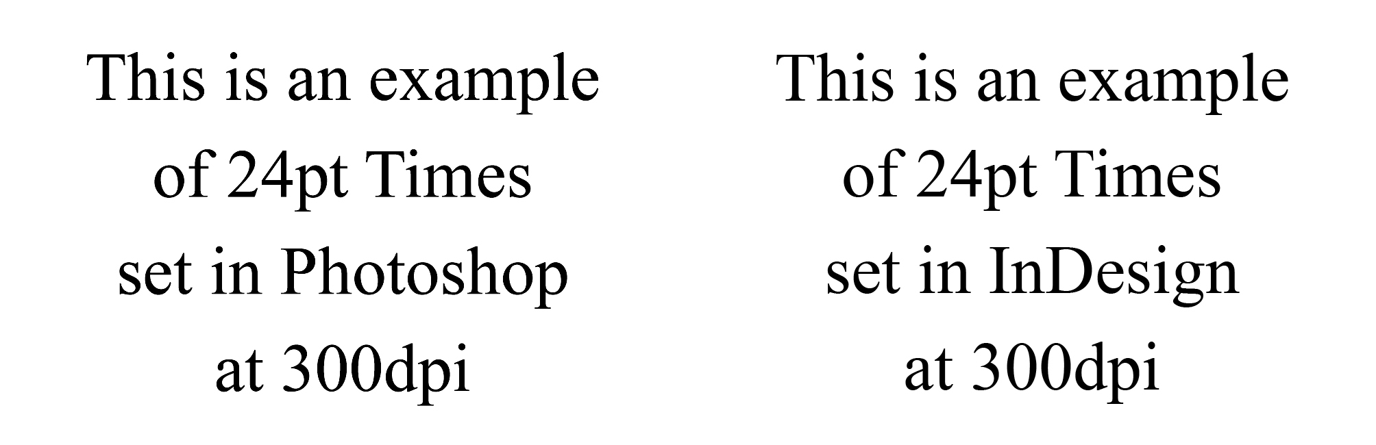
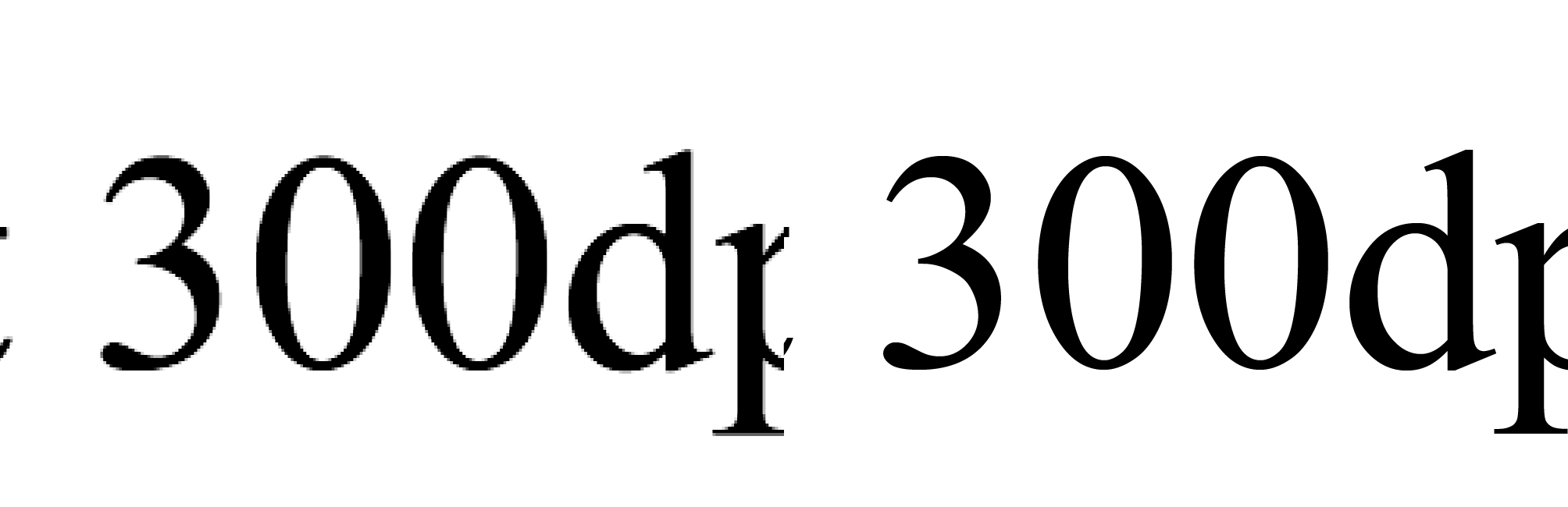
Below is an example of text set in Photoshop compared with InDesign – although there may be no appreciable difference at 100%, when enlarged the text set in Photoshop becomes fuzzy and poor quality compared with InDesign. This will also be the case with text that is set in a file that has a resolution of less than 300dpi. Click on the images to see the differences.
Any images you use in your artwork should be 300dpi CMYK – lower resolution images may look blurred or have nasty blocks that will show up in the final print. Although our modern digital press can smooth jagged images it cannot convert low resolution images to high resolution. Also, RGB images are used for displaying on computer monitors or phones and will display vibrant colours in a different way to print.
Colour
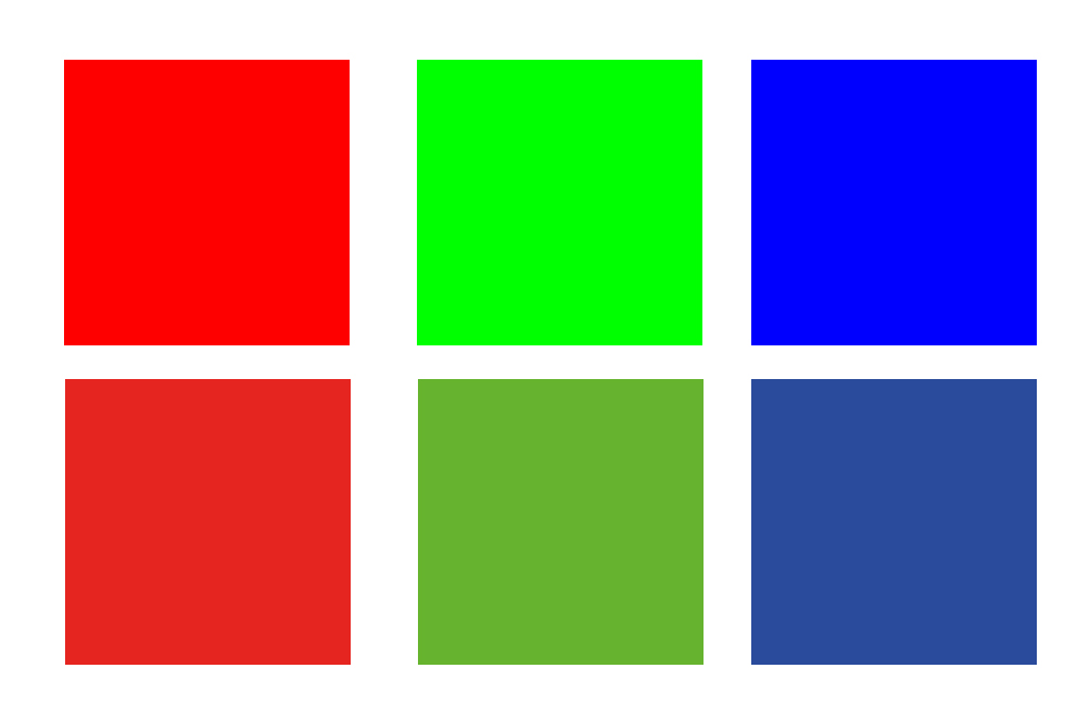
Below is an example of Red, Green and Blue represented by corresponding RGB and CMYK values – the top three colour chips are RGB, the bottom three are the CMYK equivalents. This is how colours will print on a conventional digital or lithographic press.
The same theory applies to spot colours. Spot colours are specially prepared inks that use pigments rather than the standard Cyan, Magenta, Yellow or Black (K) inks. For this reason, there are certain spot colours that will not reproduce well on a four-colour conventional lithographic or digital press. Examples of this are Warm Red, Orange 021 and Blue 072. There are many other spot colours that will not convert well to four-colour and we would be happy to advise if you have a spot colour requirement.
For the same reason, the use of Hexachrome, Day-Glo or metallic colours should be discussed with us before incorporating them into a design. Also Blacks should be 100% (Pure) Black and not four-colour black. Photoshop’s default black is a Rich Black, which is a mixture of all four colours.
Generally our digital press will convert Rich Blacks to Pure Black but, in some circumstances, this is not always the case. Rich Black is far denser than Pure Black and can produce undesirable results. If your printing is to be used in a laser printer, i.e. letterheads, then in some rare cases, the print can lift off due to the heating process in laser printers.
Layout
When it comes to preparing your design it would be advisable to discuss it with us first before steaming ahead and producing something we cannot use or print from. While we can print any size digitally up to A3, odd sizes may not be economically viable and may cost more to produce. Typically we produce material to the ISO ‘A’ Series formats (A6, A5, A4 and A3 as well as DL for compliments slips) as these sizes produce the minimum waste when trimmed down. If your design falls outside these formats, please discuss your requirement with us prior to producing your artwork to avoid any added expense.
It is always a good idea to bear in mind that there should be a ‘safe margin’ around your artwork of a minimum of 5mm – this will ensure that all your text and images remain in the print area and don’t risk getting cut off when finally trimmed. If your design has a background or image that you want to run off the page, then you will need to make sure you add a minimum of 3mm ‘bleed’ all around your artwork.
If your design is to be multi-purpose, i.e. an A4 poster and an A5 leaflet, then produce your artwork to A4 as it is more desirable to reduce down rather than scale up.
Please refer to our Artwork Setup guide for tips with page layout.
You would also make us very happy if you produced your artwork ‘one up’, to the correct size and not placed on a larger page.
Illustrator PDFs
If you are producing your artwork in Adobe Illustrator, create it in the native .ai format and, when you are satisfied with your final design, save it as a Print Ready PDF. Be sure to uncheck the option to save the PDF with Illustrator editing capabilities as this will vastly reduce the file size of your PDF – we have seen 300Mb files reduce to 2 or 3Mb when this option is turned off.
Image Formats
If you are sending us image files to print, please ensure they are saved as CMYK TIFF files with LWZ compression enabled – again, we have seen a substantial reduction in file size with this option, which not only makes them possible to email, but significantly reduces the time taken to process the file for printing.